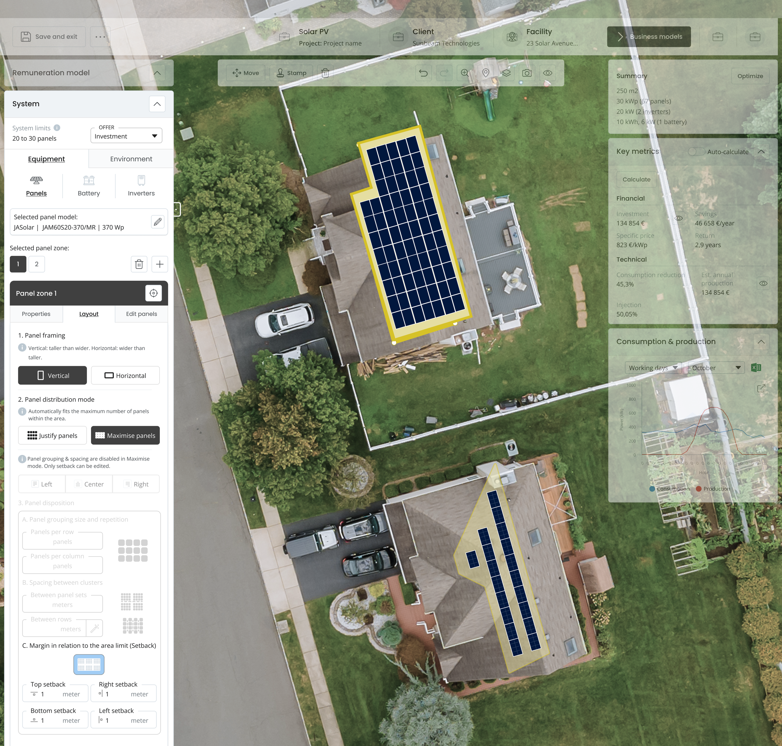
Solara
A web-based configuration tool that helps users design solar panel layouts
Role:
UX/UI Designer, UX researcher
Details:
Company: Effizency
Industry: Energy Technology
Duration: june - August 2025
Tools:
Figma, notion
The problem:
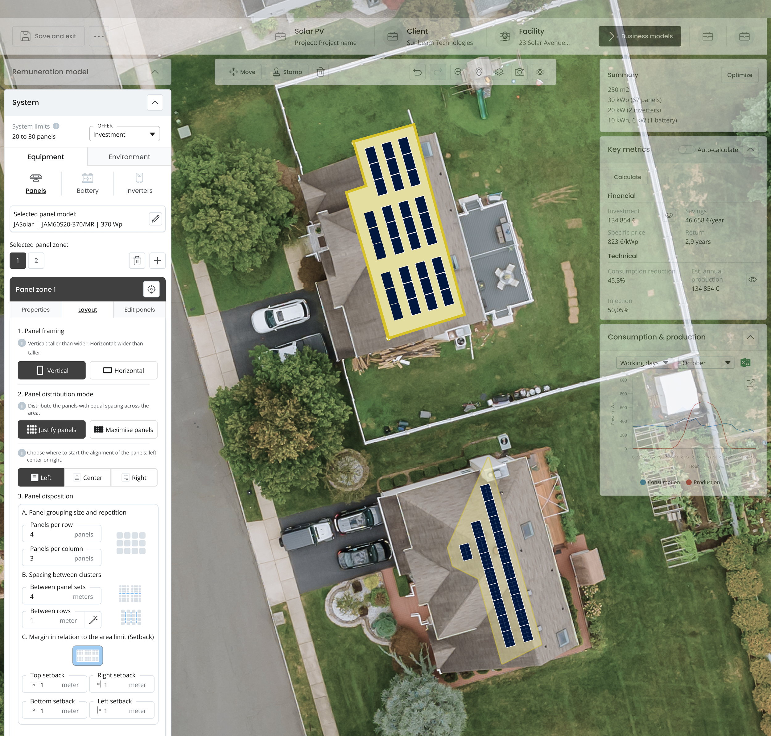
Users found layout controls like “justify,” “maximize,” and “setback” unclear, causing confusion and trial-and-error interactions.
Make the layout configuration clearer and faster through better feedback, labels, and visual behavior.
The goal:
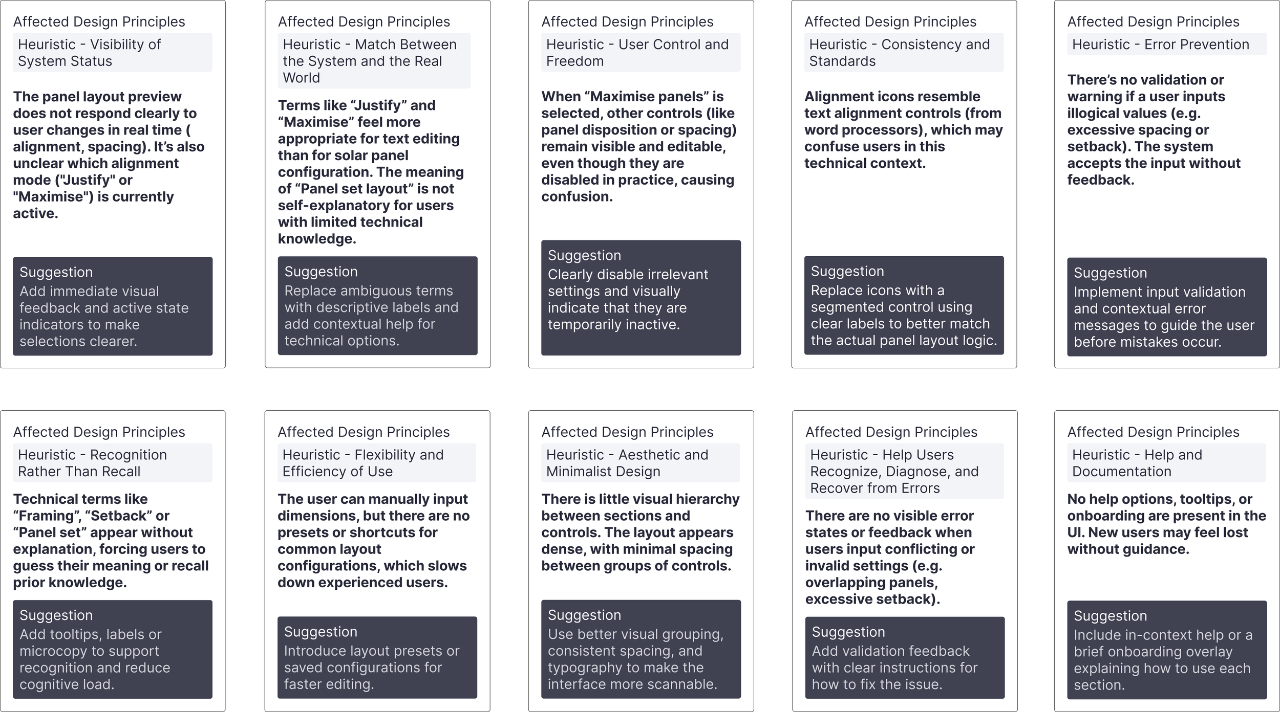
Heuristic evaluation
Exploring different approaches
1. Guided step-by-step flow with simplified controls
This direction aimed to guide the user through the configuration process one step at a time, breaking down complexity by isolating decisions such as orientation, alignment, disposition, and setback. Simplified language and sequential steps would support users unfamiliar with layout logic, while some advanced options could remain hidden until needed.
2. Fully visual panel with real-time feedback
An interface where all settings remain visible and editable in a single panel, with contextual help and an interactive preview that updates instantly as the user adjusts options.
After comparing both options, I iterated on the second design to improve clarity and usability, adding helper text and new controls.
The old UI on the left had unclear controls and ambiguous copy, which users said often caused confusion (highlighted in red).
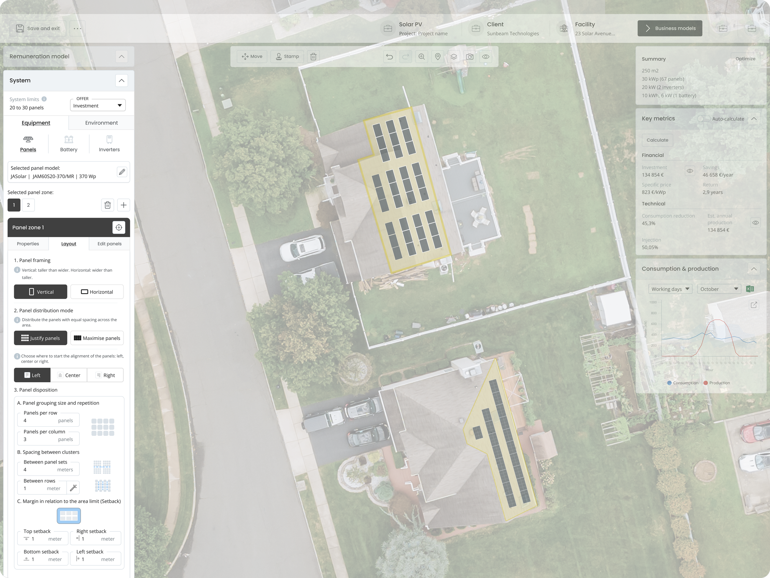
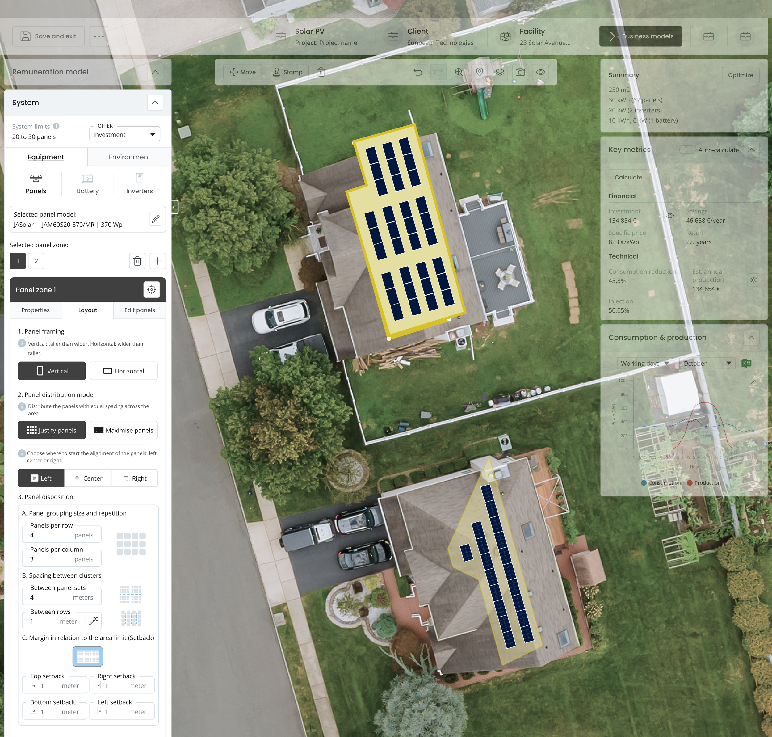
The redesigned version on the right is an attempt to improve clarity through contextual help, clearer labels and controls.
Improved UIOld UISegmented control replaced abstract icons to improve the clarity of alignment modes (Justify vs Maximise)
Inline help was added to explain settings dynamically and prevent confusion
New setback controls allowed users to define custom values per edge, offering more precision without adding clutter
Several refinements were introduced:
Highlighted toolbar
Testing
Why option 2 was chosen:
Given the users' time-sensitive context and the need for quick configuration, the second approach provided a better balance between clarity and control.
After evaluating different directions and testing core interactions like Justify, Maximise and setback, I felt confident that the second approach offered the best balance between clarity and control.
After testing and evaluating, users now can quickly control and operate the system controls.
Justify panels mode
Maximise panels mode
