Nudge
AI-assisted fintech MVP that warns you before you overspend
Role:
Product Designer
Details:
Industry: Fintech
Duration: March 2026 (3 weeks) MVP scope
Tools:
Claude, Notion, ChatGPT, v0, Snack, Google Forms, Google Meet, Fireflies
0 taps
to understand spending risk on open vs 2–3 taps in competing apps
100%
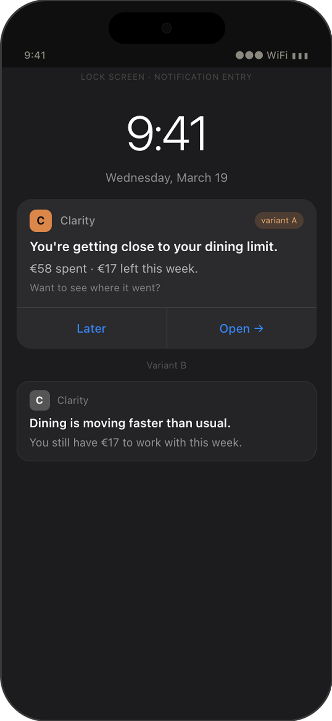
described the spending alert as "calm" or "like a message from a friend" - none felt anxious
2× improvement
on action screen score after one design iteration based on user feedback
How AI supported the design process
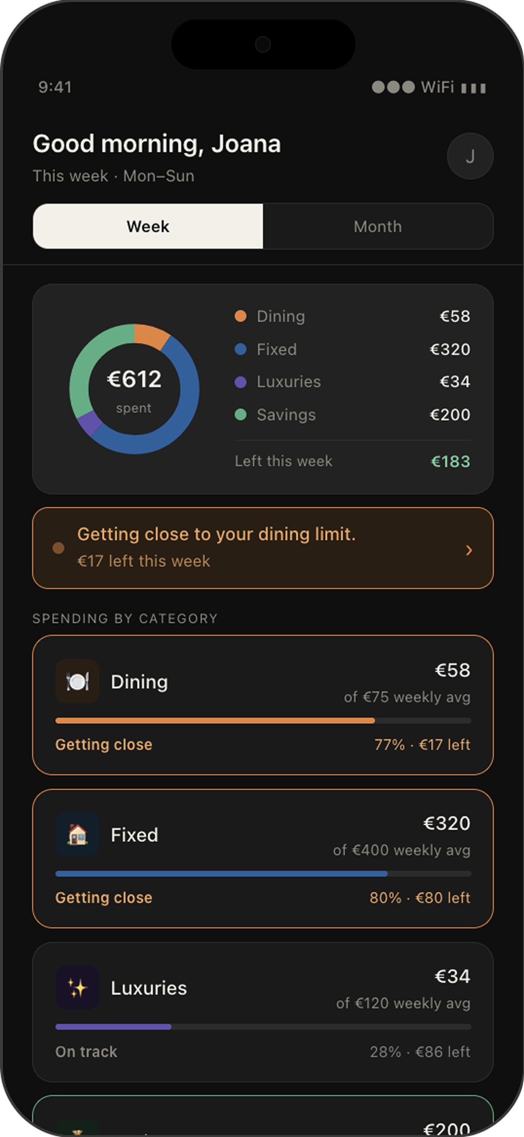
After - Final Design

I used Claude to accelerate research and documentation throughout the product design process. It helped generate research deliverables such as benchmark analyses, personas, user journeys and design hypotheses. Every output was reviewed, challenged and synthesised before informing product decisions.
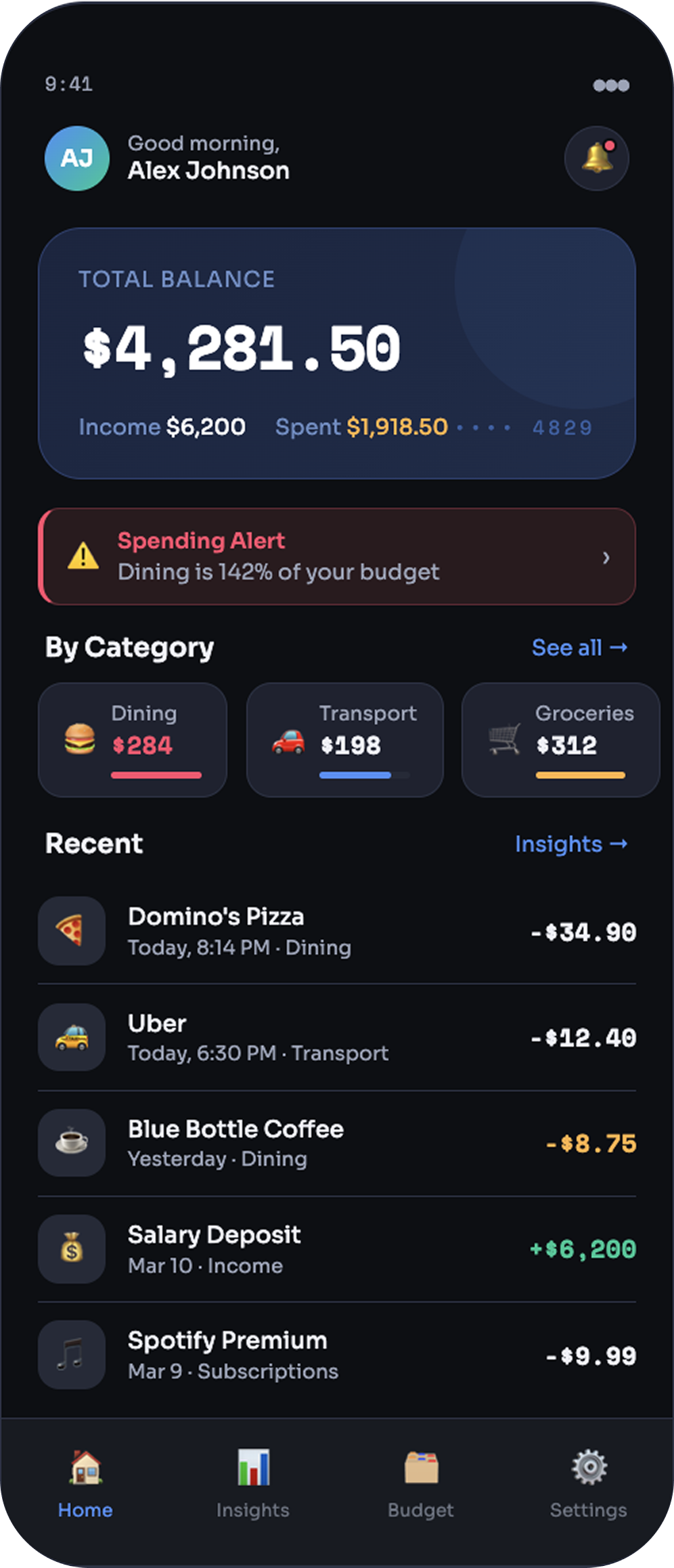
Before - First Prompt Design
The problem:
Most people have no early warning system for their spending. Bank apps notify users after they've already overspent.
This creates a specific emotional problem. When a bank notification arrives, it triggers anxiety, not because it helps, but because it confirms damage already done.
The goal was to design and test a smart spending feature within a 3-week sprint and MVP scope, an early warning system that works without any setup, speaks like a person rather than a bank, and design a proactive spending assistant that helps users act before reaching their limit.This is the gap every competitor in the market left open.
AI-assisted prototyping enabled rapid iteration and usability testing throughout the sprint.
The goal:
Benchmark Analysis
What competitors do well,
and what none of them do at all
3 apps analyzed hands-on: Revolut, Spendee, Activo Bank. Cleo (US-only) used as tone reference.

The gap all three leave open: No app closes the loop. Revolut ends at the notification. Spendee gives partial context. Activo bank has the deepest drill-down but still ends at a transaction list with no guidance. None ask "what do I do now?"
User Research
What users actually want
vs. what apps give them
Each research question mapped directly to a gap from the benchmark.
The answers validated the product direction completely.
"Setting a weekly budget and receiving a notification that you're almost reaching that budget."
— Joana, describing the ideal product unprompted.
4 patterns that shaped the product

Category thinking is
universal
All 4 participants named their own category systems without prompting. Category-first design is not an opinion, it's the natural mental model.

Users want to know before it's too late
Joana wants a warning before the limit. Mafalda wants weekly visibility. Sara set a proactive monthly limit herself. The shared need across all 3 is forward-looking awareness, not a report of what already happened.

Weekly cadence is the right default
All 4 participants independently landed on weekly. Sara, the most engaged user, who already tracks by category and set her own monthly limit, said "weekly spending would be enough."

Tone is a structural problem
Joana finds bank notifications anxiety-inducing because they confirm money is already gone. Sara finds the same type of notification helpful. The difference isn't the notification, it's what it says and what it expects her to do.
Product Definition
For people who want to feel in control before it's too late
Personas
Primary
The Anxious Reactor
Only uses her bank app. No budgeting system.
Finds out she's overspent after it's happened. Bank notifications make her anxious because they confirm money is already gone.
"Setting a weekly budget and receiving a notification that you're almost reaching that budget."
Secondary
The DIY Tracker
Tracks manually in phone notes. Own category system.
Has the discipline. Apps either cost money or don't add enough value. Quit a tracking app the moment it went behind a paywall.
"It would be good to have something that tells me weekly how much of each category I've already spent."
Secondary
The Active Saver
Already uses a tracking app. Set a monthly limit proactively.
The most self-sufficient of the three, and still said "weekly spending would be enough." This confirms the weekly cadence is a ceiling, not a floor.
"Weekly spending would be enough."
4 differentiators from the benchmark

Revolut: 1 tap · Activo: 2-3 taps + tooltip tour
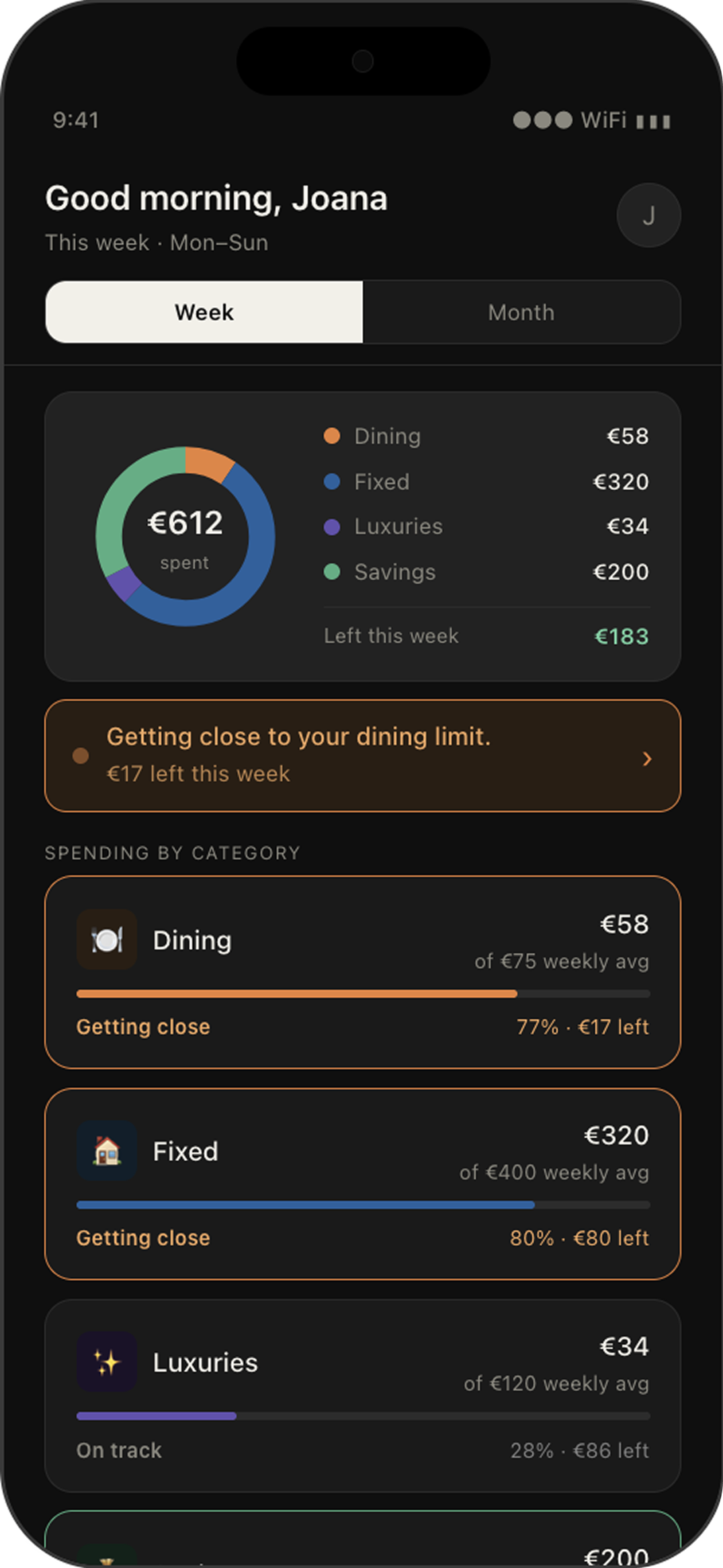
Insights on home - 0 taps away
Only Spendee does this. Following their model was the obvious structural decision.

All 3 competitors: budget setup required
Proactive, velocity-aware alerts
Fires when spending pace suggests the limit will be hit early, before it happens, without any configuration.

Revolut: clinical · Spendee: neutral · Activo: administrative label
Warm, conversational tone
Cleo (US) was the only benchmark reference for getting this right.

Revolut: dead end · Spendee: partial context · Activo: no forward guidance
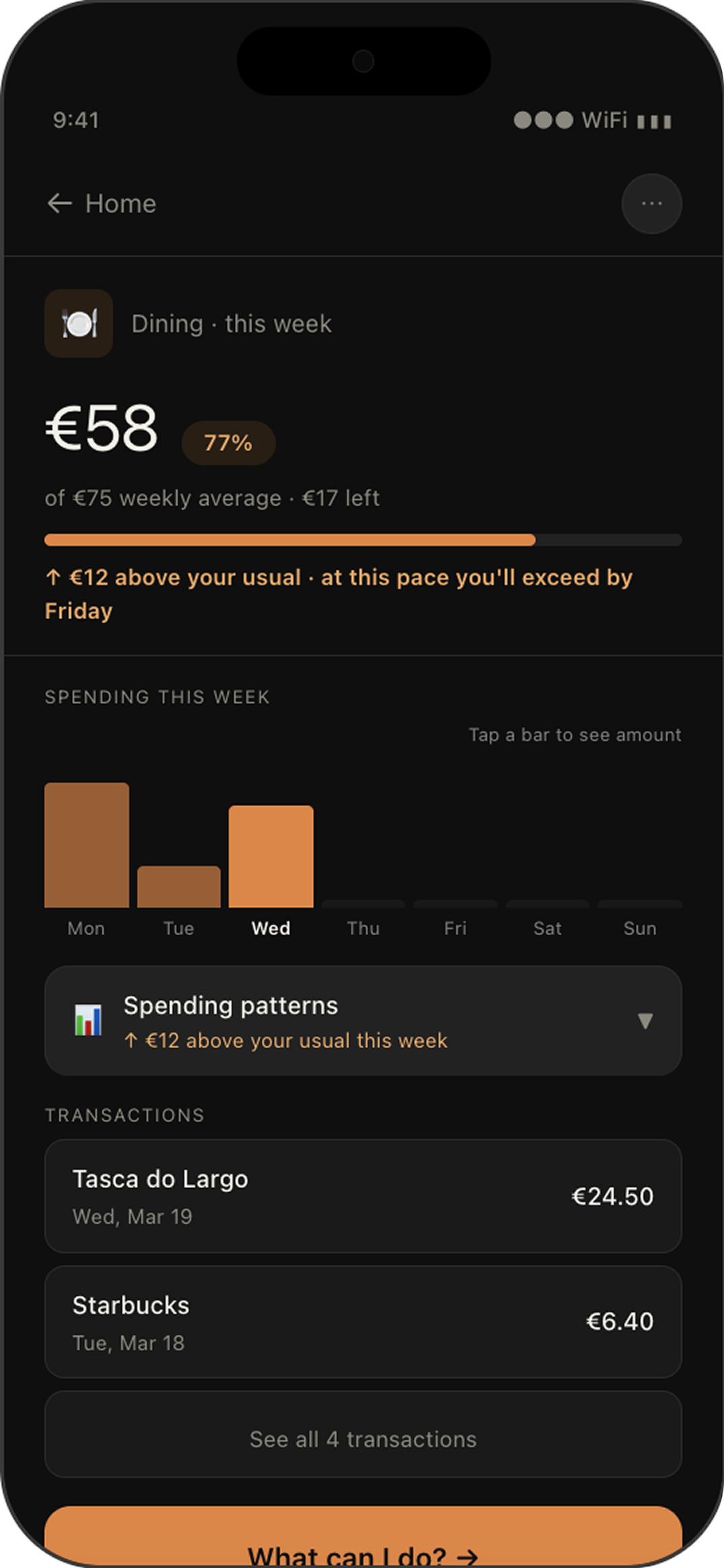
Every insight ends with a next step
No app closes the loop. The gap all three competitors leave open.
Sitemap
The sitemap was shaped by three things: what the benchmark showed about where insights get buried, what users told us about how they actually check their spending, and one core principle, the product must work from the first open, without any setup.
Key flows
Flow 1 serves users who check in by habit, the DIY Tracker and the Active Saver.
Flow 2 serves users the product has to find first, the Anxious Reactor. Together they cover all 3 personas with just 4 screens.
Design & Iterations
Every change was grounded
in what a user said or did.
Built in React Native using AI-assisted development.
Tested with 3 participants across 3 sessions.
The 2 most impactful changes are documented below.
After test 1
Two competing banners merged into one
Version 2 had two coloured alert strips stacked on the home screen, orange for at-risk, green for on-track.
They fought for attention and created visual noise.
"It's a bit full, the screen. I feel like I was dividing my attention between everything."
-User Mafalda, test 1
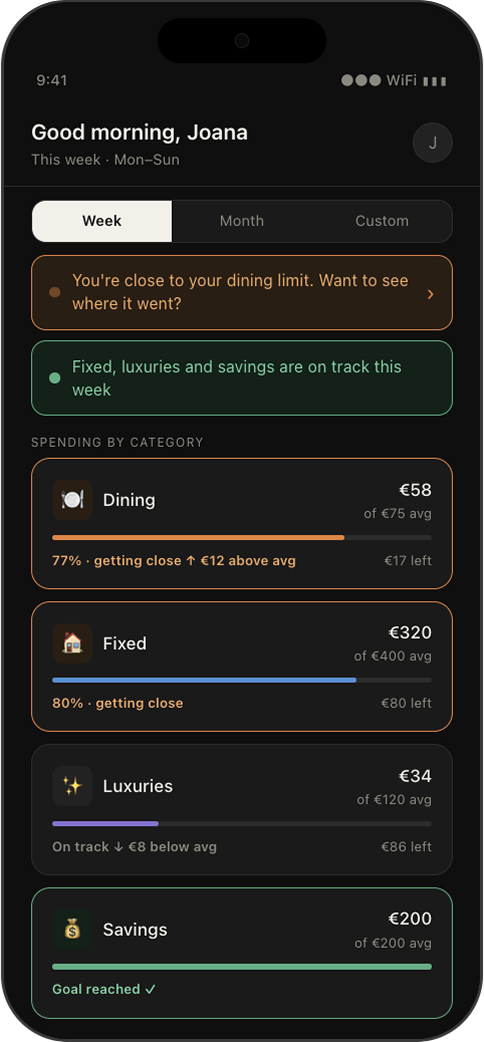
V2 Home screen - two banner fighting for the user’s eye
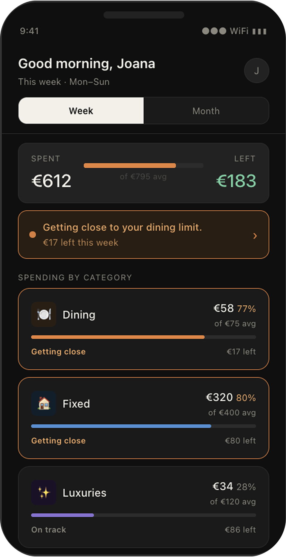
V3 Home screen - One strip, one message
After test 2
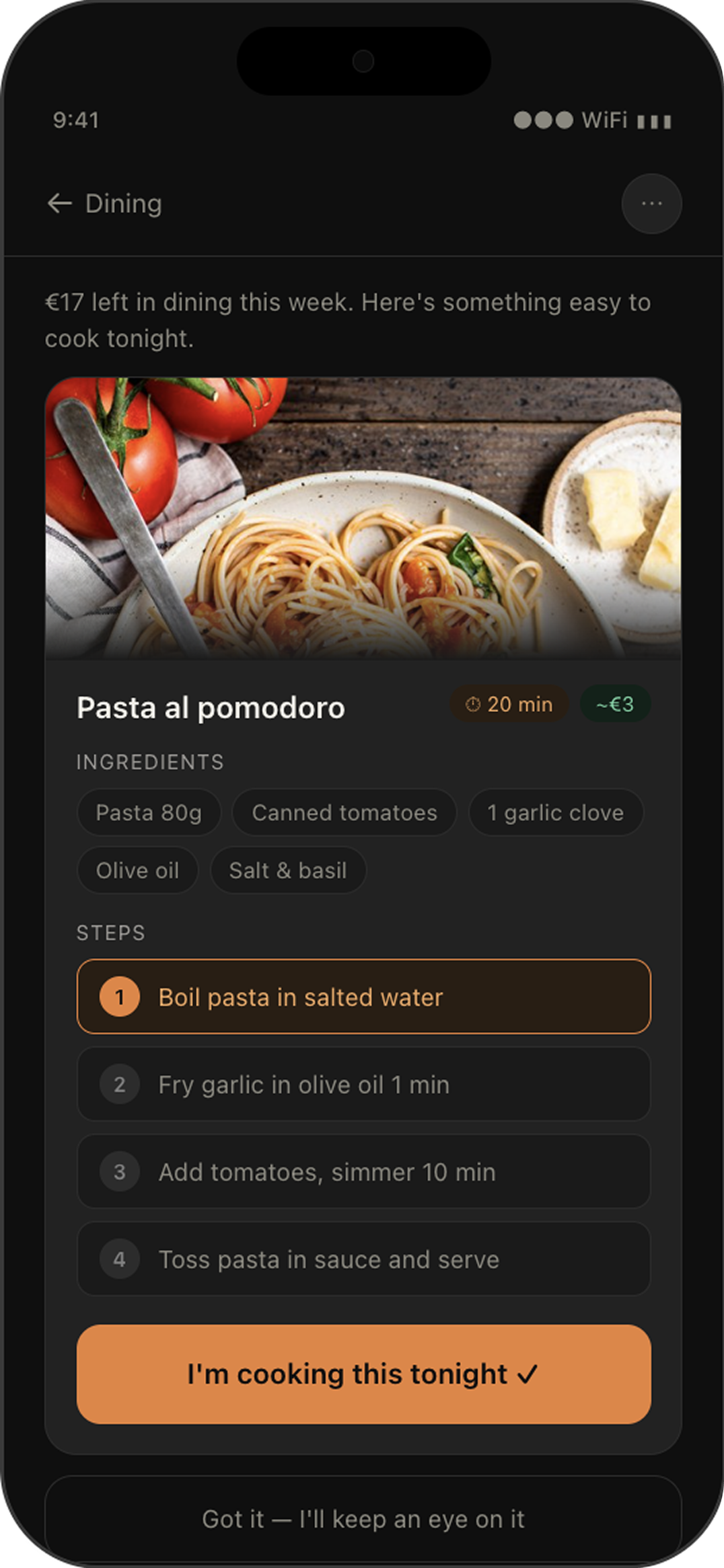
Vague reminder replaced with a step by step suggestion to save money on dining category
The Suggested Action screen said "I'll cook at home this week." Users tapped it, but it felt like a commitment to nothing concrete.
"I would find it more relevant to have a suggestion of something I could cook at home. That would be more relevant to me than setting a reminder."
— User Mafalda, test 1
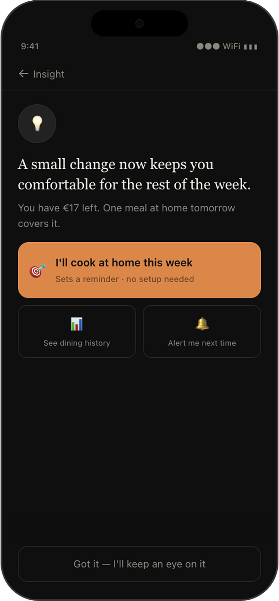
V2 Action screen - Reminder "I'll cook at home this week"
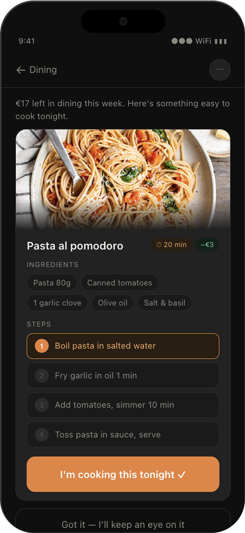
V4 Action screen - suggestion recipe with steps
Usability test results
100%
of participants said the notification felt calm and useful across all tests, from the very first prototype. The tone hypothesis was right from day one.
2→3→4
The suggested action was the hardest screen to get right, scored 2/5 in Test 1, 3/5 in Test 2, 4/5 in Test 3 after the recipe card redesign.
S1 · S2 · S3
All 3 success criteria passed across all test sessions. The home screen was readable in under 5 seconds. The loop was closed without hesitation.
The hardest screen to get right
The suggested action screen scored the lowest on user form scores. The improvement happened after the recipe card replaced the vague reminder, confirming the direction of the fix was correct.
"It gives me motivation and ideas to not hit the limit, cook at home instead of going out."
— Pedro, test 3
V7 Action screen - suggestion recipe with steps
Final screens
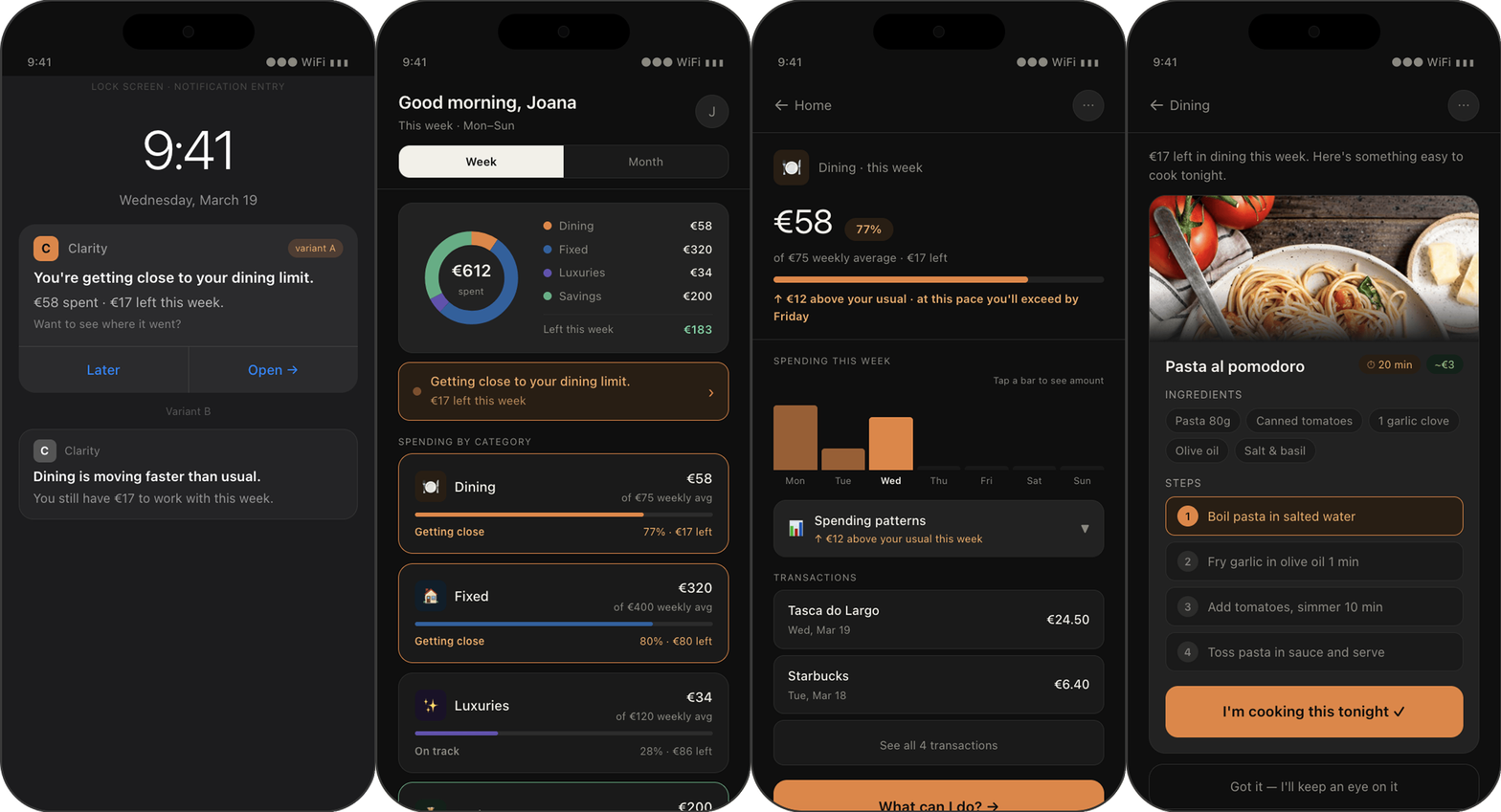
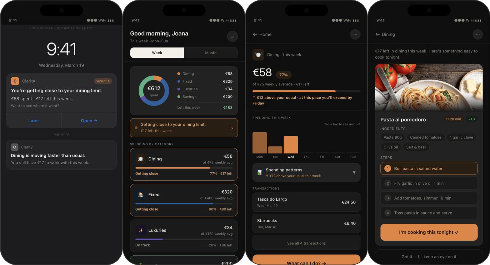
Push notification
Home screen
Category detail
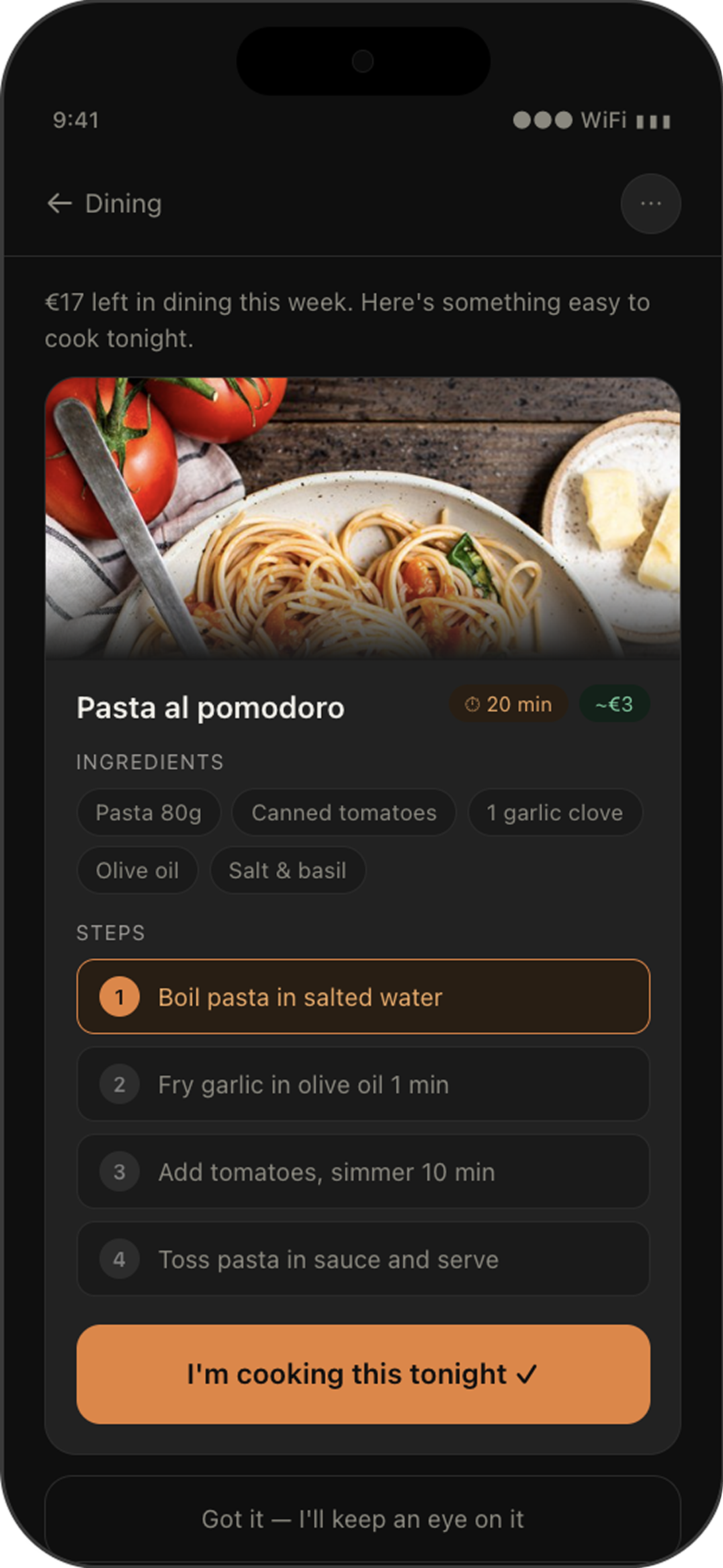
Suggested action
What I took from this
Working with AI changed how I think about prototyping. AI accelerated the prototyping process, allowing me to focus on understanding the research, validating assumptions and making product decisions.
The process was faster than anything I'd done before. But speed only creates value when it's backed by solid design thinking, critical evaluation and iteration.
If I did this again, I'd test with a larger and more diverse group of participants, and evaluate how the concept performs over longer-term use.