Merchandising manager
An internal tool that helps product and
e-commerce teams manage and organize product catalogs efficiently
Role:
UX/UI Designer, UX researcher
Details:
Industry: Fashion & e-commerce
Duration: September - December 2025
Tools:
Figma, notion, figjam, perplexity, chatgpt
3 → 1
Reduced catalog access from 3 steps to 1 (67% reduction)
✓
100% task completion rate (3/3 participants)
↓ Manual work
Lower reliance on manual operations
The problem:
The product team faced difficulties managing multiple catalogs and categories due to outdated manual processes. Tasks like organizing products, updating visibility, and keeping catalog data consistent required unnecessary steps.
To design an intuitive internal tool that allows product and e-commerce teams to easily manage multiple catalogs, organize and update product details quickly, reducing manual effort.
This goal is going to be measured with usability tests and satisfaction surveys.
The goal:
UX Research
Stakeholder interviews
Early in the project, I sat down with the Product Manager and the Design Lead to truly understand the story behind the product. We met in person to discuss their business goals and how they handled their catalog operations day to day.
Early alignment with stakeholders ensured the solution addressed both operational needs and technical feasibility.
Selected interview questions and answers:
Q: What is the goal that we are trying to achieve?
A: The goal is to simplify the daily management of catalogs and products through an intuitive interface adapted to the real needs of users.
Q: Who are the main users of this tool?
A: The product team that manages products visibility and updates.
Q: How do these users currently manage catalogues and categories?
A: Through a salesforce platform. It’s a complex outdaded interface for the team that needs to manage catalogues and products.
Q: What are the most important actions users need to perform?
A: Reorder products through drag & drop, duplicate products, change product images, identify unsorted, out of stock and high rotation products.
Affinity mapping
“We need to give the product team an intuitive interface to keep products organized within categories, without relying on manual or technical workarounds.”
- Daniel, UX & CRO Manager
Information architecture
Research Findings
Manual and time-consuming processes
Teams rely on repetitive manual updates to manage categories, visibility status, and product positions, which often leads to errors and slows down catalog operations.
Image management is essential
Teams need to reorder, duplicate, or replace images easily within each product to ensure the right visuals appear online.
Need for flexible control
Users want more control when organizing products, such as drag-and-drop or positioning by number, to speed up daily management tasks.
Clarity for out-of-stock items
Teams need a clear visual indicator to easily identify unavailable products and act quickly when replenishment is needed.
UX Design
Task flows
I explored five flows on total, but focused on two main user flows:
Flow 1: Selecting a catalogue
Flow 2: Managing products within a category
Breaking down these processes step by step helped me uncover hidden complexities such as handling different types of categories, product variations, and unsorted items.
This phase was essential to ensure the system could adapt to real-world catalogue operations.
Sketches
With the help of task flows, I started by sketching quick ideas to explore layout and flow possibilities.

First sketch - select catalog
This initial sketch represents the first screen of the merchandise hub. It’s where the user selects a catalogue before starting to work.
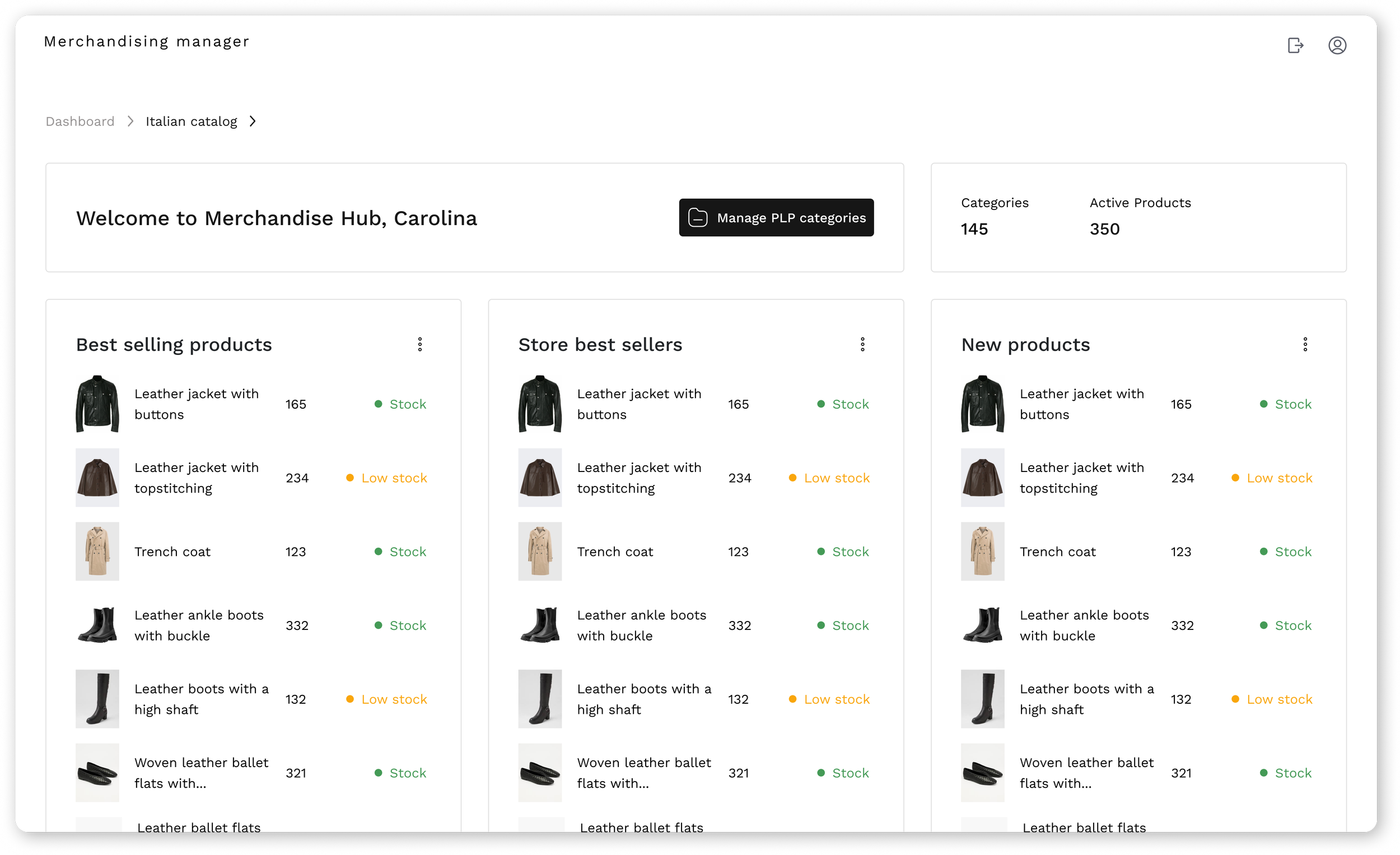
Second sketch - catalog overview page
This second sketch represents the next screen of the merchandise hub. It shows an overview of the previously selected catalogue, including the number of categories and the active products it contains.

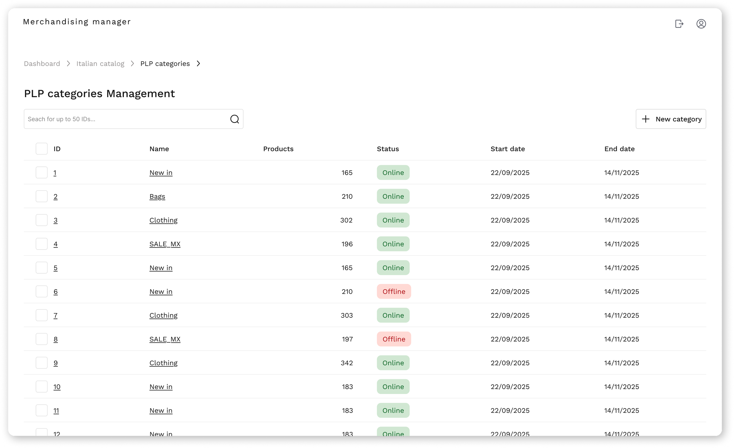
Third sketch - categories management page
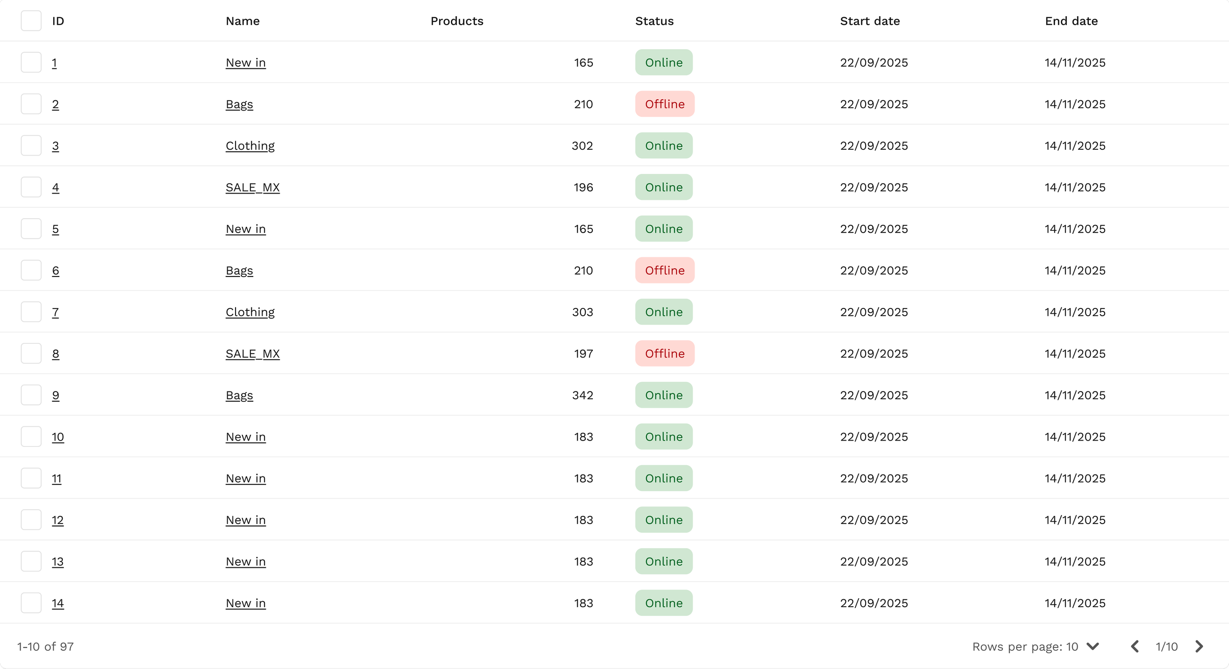
This third sketch represents the third screen of the merchandise hub, featuring a data table with all existing categories, including their status, ID, and dates.

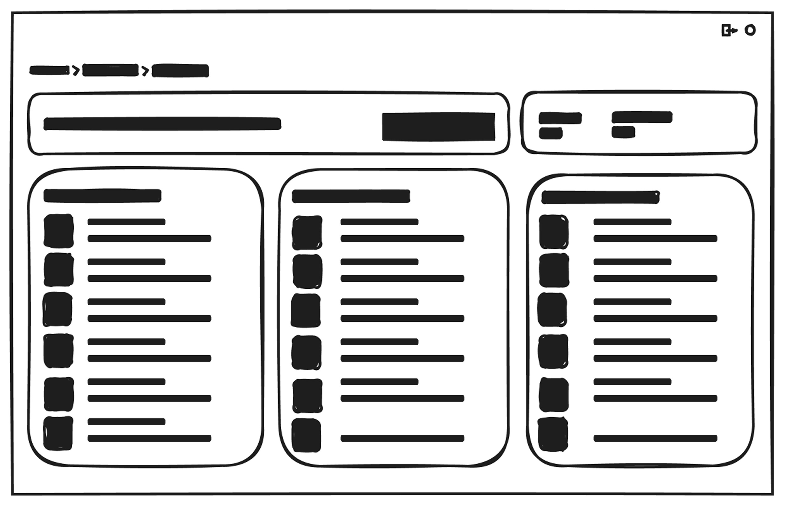
Fourth sketch - product management page
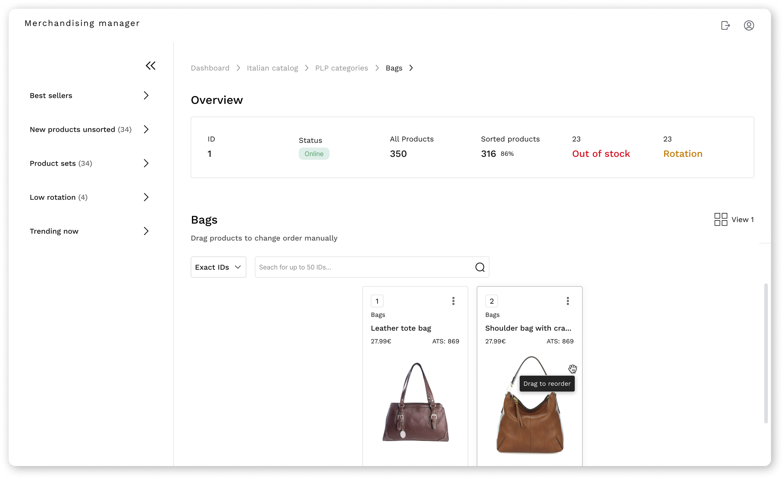
The fourth sketch represents the screen inside a category, showing all its products, details, and the sidebar.
2. High-fidelity explorations
I translated the main ideas into high-fidelity designs to test structure, hierarchy, and key interactions.
At this stage, the focus was usability validation rather than final visual polish.
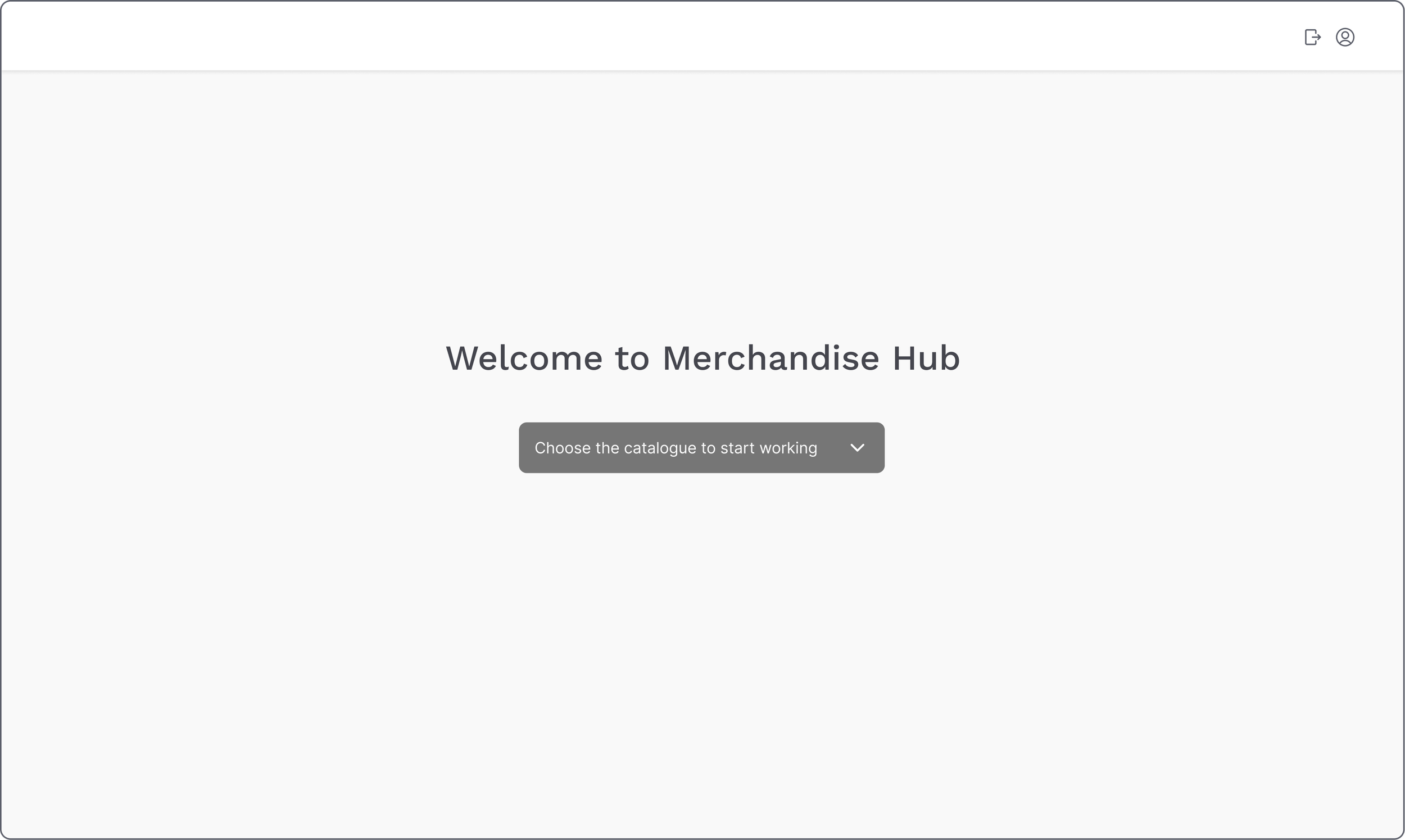
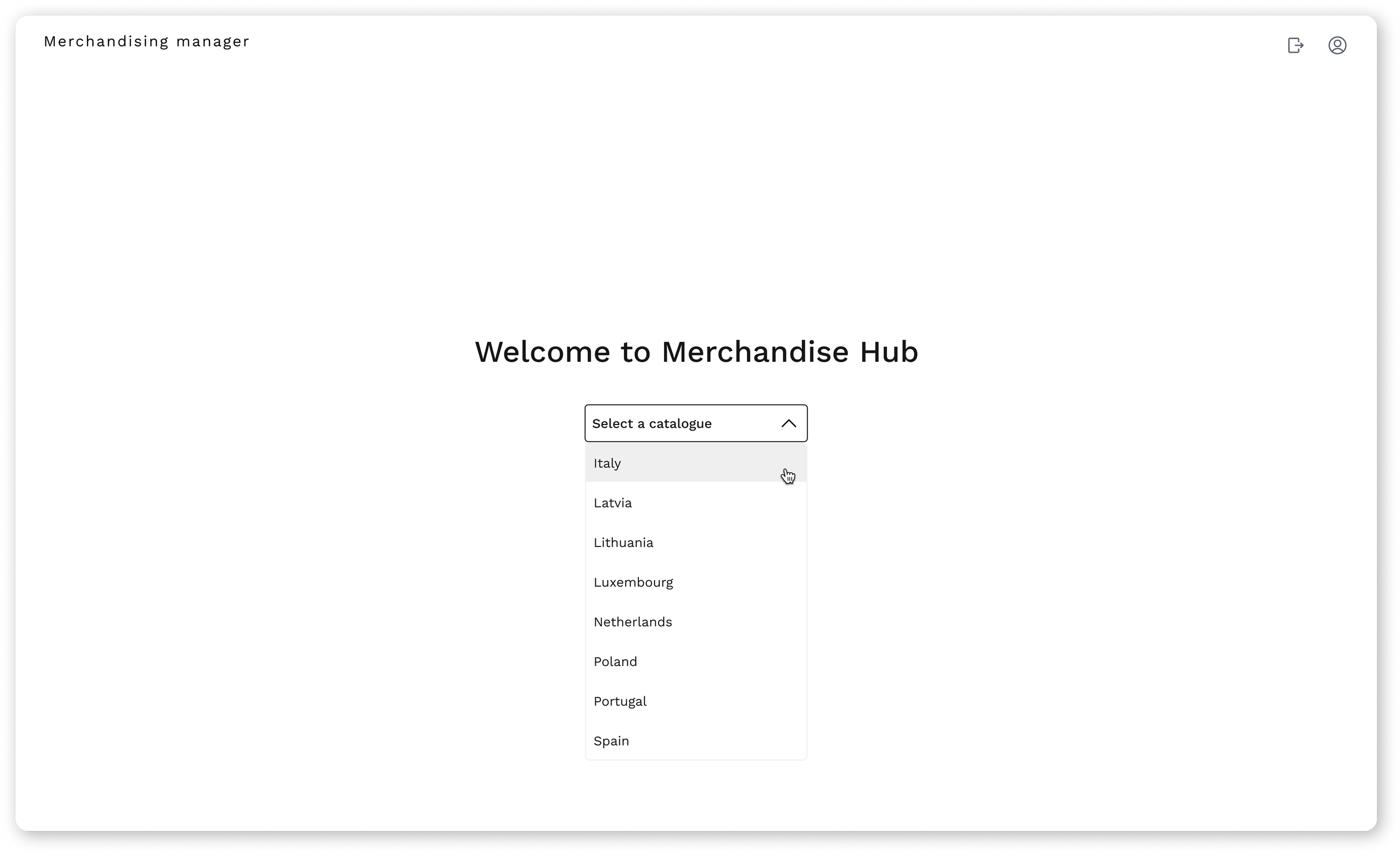
First screen - select catalog
When entering the Merchandise Hub, users are now greeted by a clean welcome screen with a simple dropdown to choose their catalogue.
Before the redesign, reaching this step required three clicks and unnecessary navigation. Simplifying it into a single action helps users start their work faster and with less friction.
Reduced catalog access from 3 steps to 1 (67% reduction).
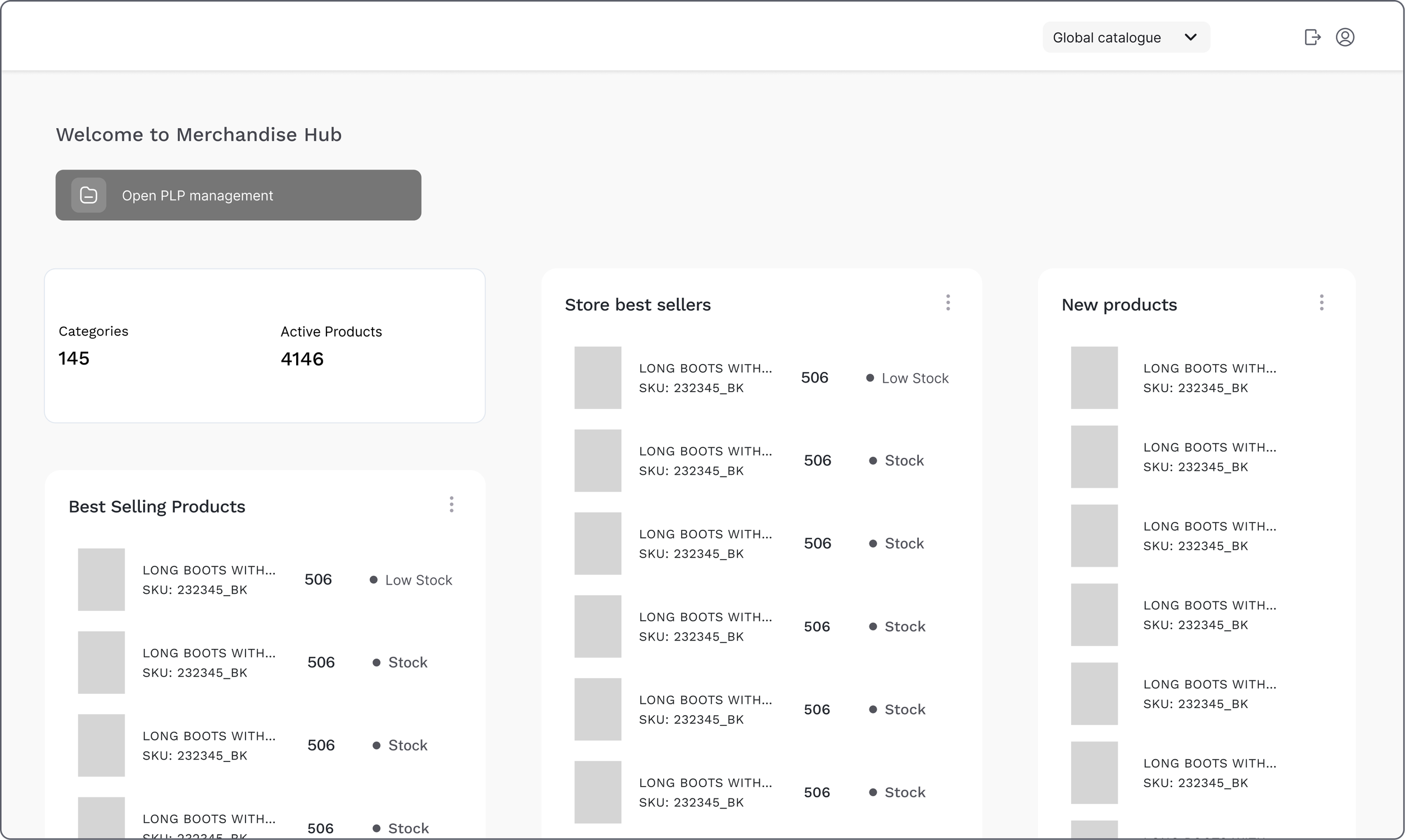
Second screen - catalog overview page
A quick snapshot of catalogue performance offering a clear entry point to manage content more efficiently.

Third screen - categories management page
By consolidating everything into a single table with quick access to visibility, product count, and status, this design reduces navigation effort and gives users clearer control over their categories offering a clear entry point to manage content more efficiently.
A table layout was selected due to the high number of categories and the need to scan IDs, status and metadata efficiently.
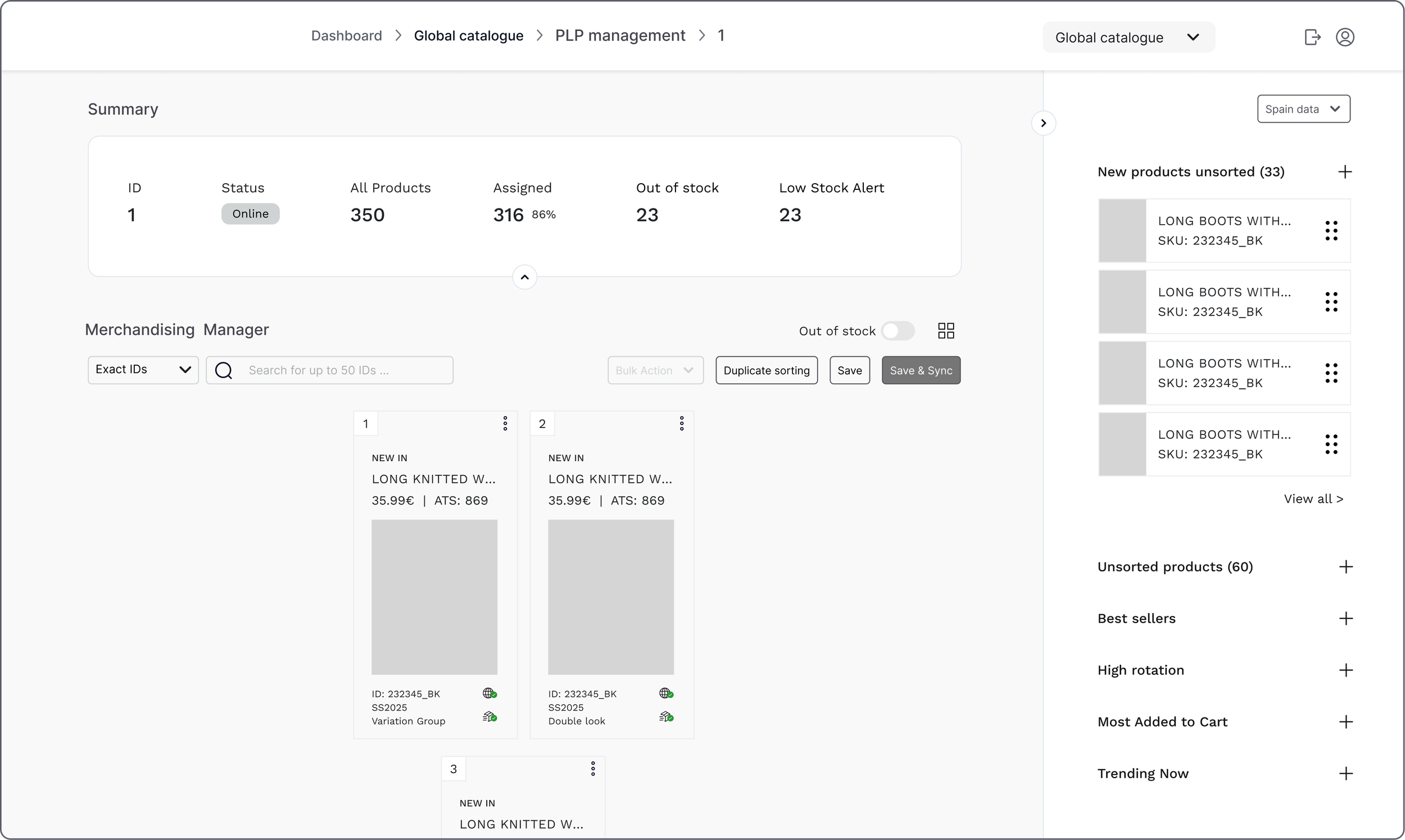
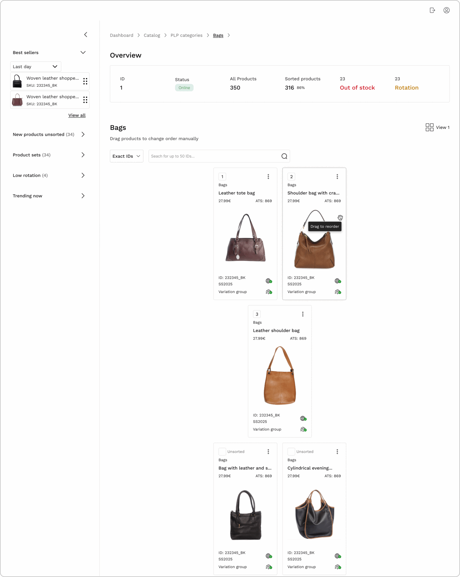
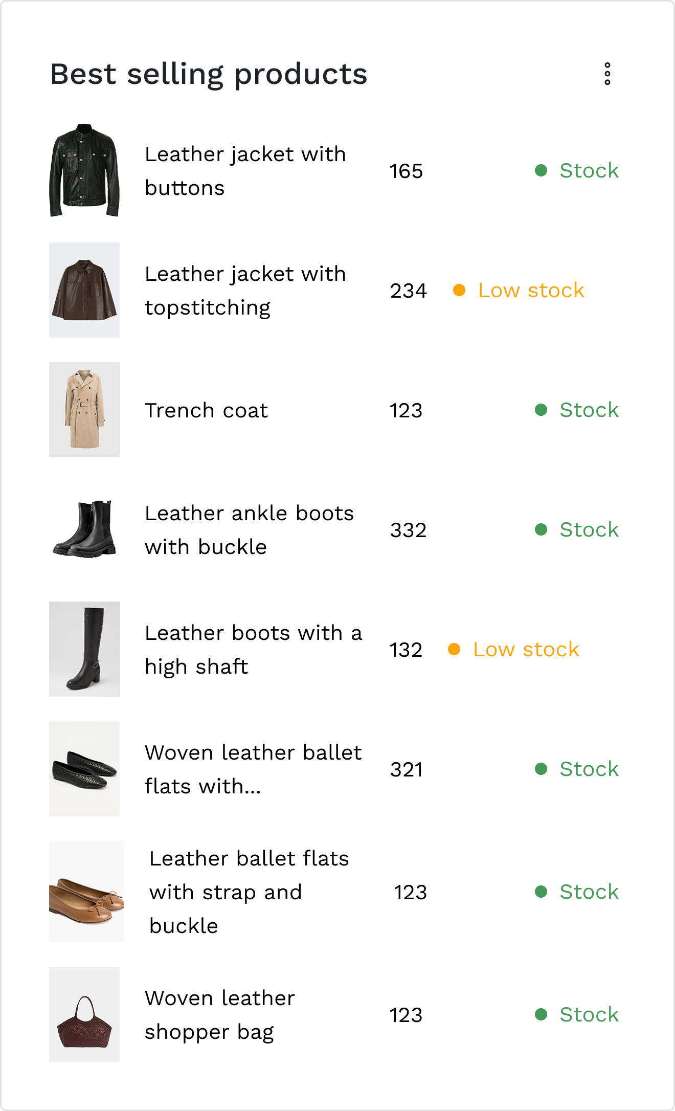
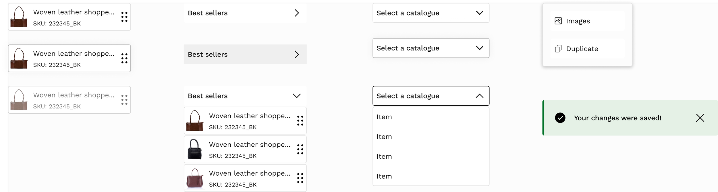
Fourth screen - product management page
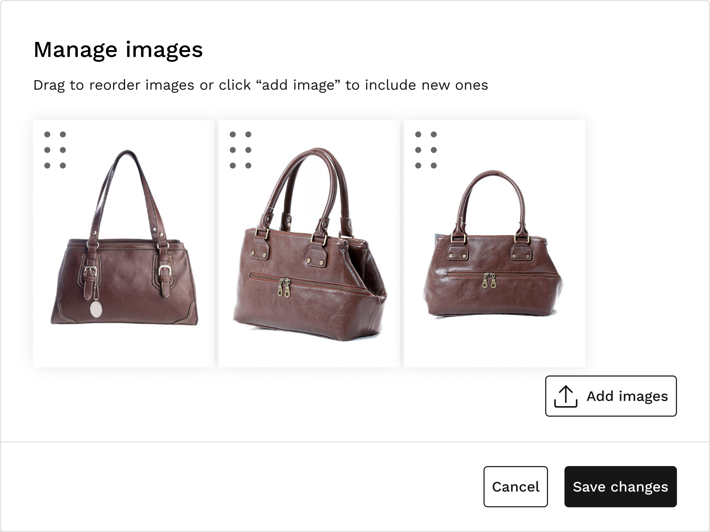
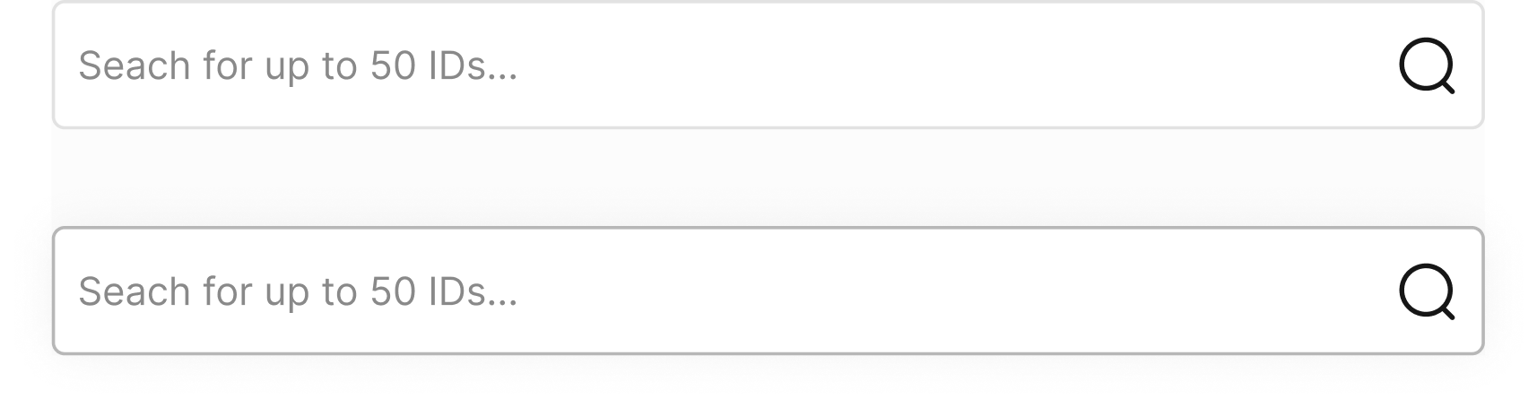
Within each product category, users can efficiently reorder items through drag and drop or numeric positioning, search products by name or ID, and instantly identify unsorted items.
Drag-and-drop was prioritised because users were already familiar with this interaction from the previous platform. Maintaining this mental model reduced onboarding friction and enabled faster product positioning.
Usability test outcomes
Focused testing to validate core catalogue workflows and identify friction points before final iteration.
Flow 01 · Accessing a category from the
catalog dashboard
Flow steps
Catalog selection → Catalog overview → Categories page
Impact
Reduced steps from 3 to 1, (67% reduction) enabling faster catalog access.
All participants completed the task without assistance.
Key insights
• Users located category access without hesitation
• Navigation structure felt intuitive
• Minor hierarchy refinements could improve long-term scalability
User quote
“I saw ‘manage categories’ here…”
— Carlos, usability test during categories access page
3 → 1 steps
67% reduction
Flow 02 · Reordering products & images
within a category
Flow steps
Categories page → Product list (category view) → Reorder a product → edit images → reorder images
Impact
Users completed reordering tasks independently, confirming usability of drag-and-drop interaction.
Key insights
• Some uncertainty around where to initiate drag interaction
• Image reordering labels required clearer microcopy
• Stronger visual feedback improved user confidence
User quote
“I’m not sure if it’s on the three dots.”
— Sara, usability test during product reordering
UI Design
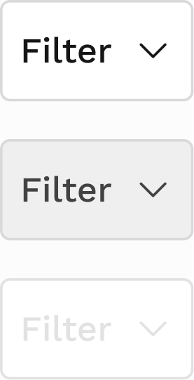
To ensure consistency and scalability, I created a set of reusable components aligned with existing brand foundations.
This helped standardise complex interactions such as tables, drag-and-drop behaviours and image management, making future iterations faster and more consistent. Built over 35 components from scratch to support this project’s specific needs.
Design system
Foundations
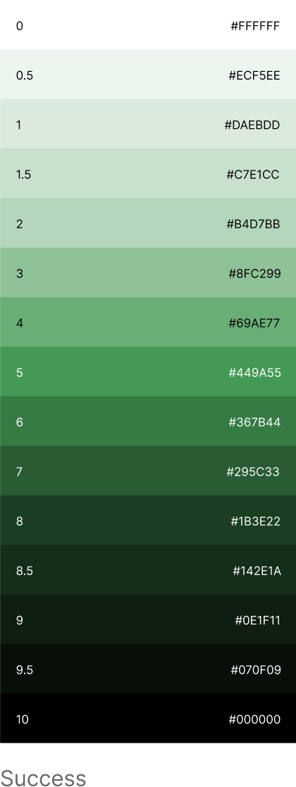
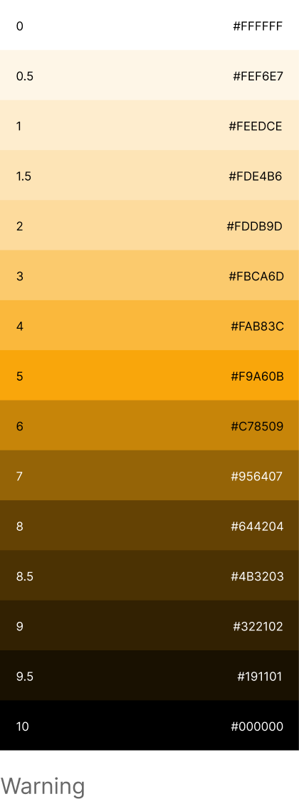
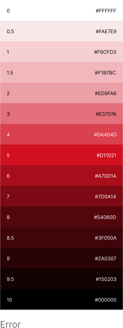
Color system
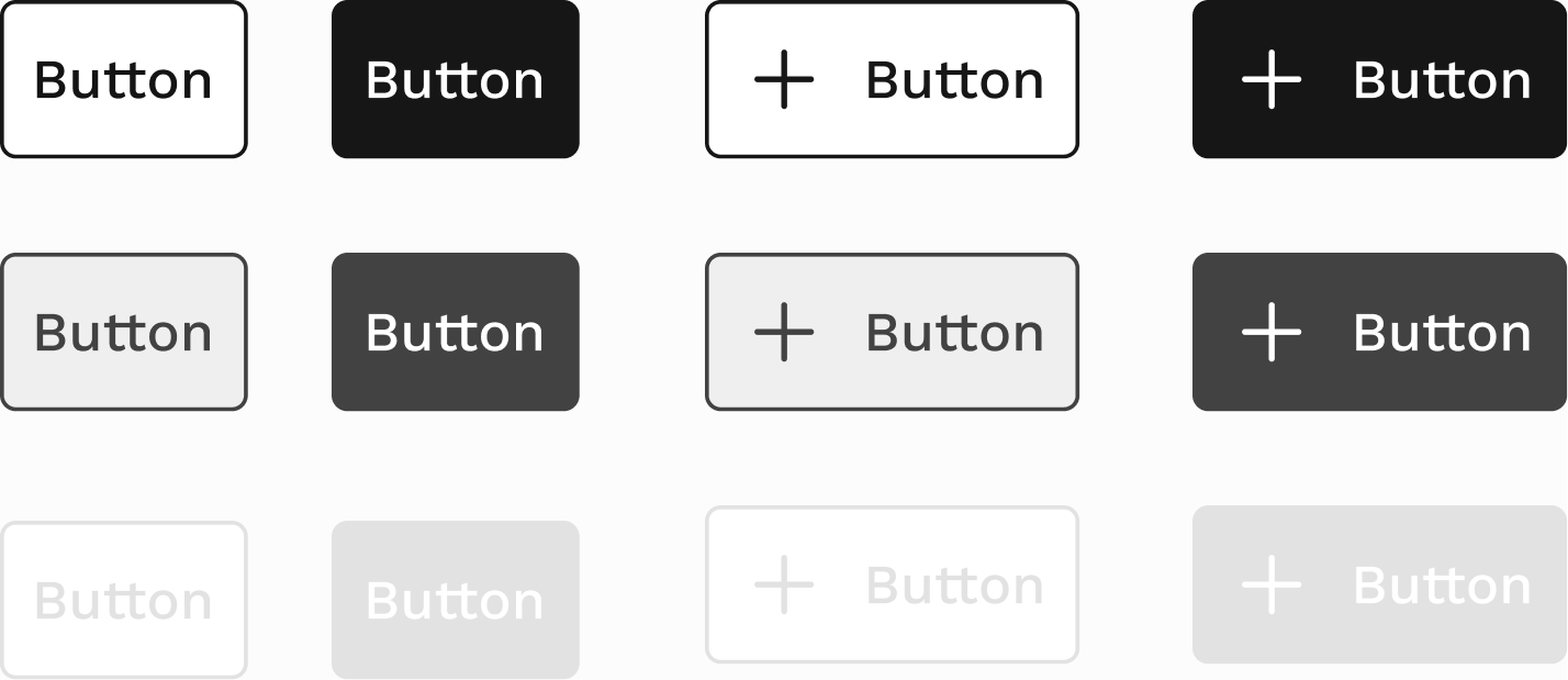
Components


Final screens
First screen - select a catalog
Second screen - chosen catalog’s overview
Third screen - catalog’s categories
Fourth screen - reordering a products position
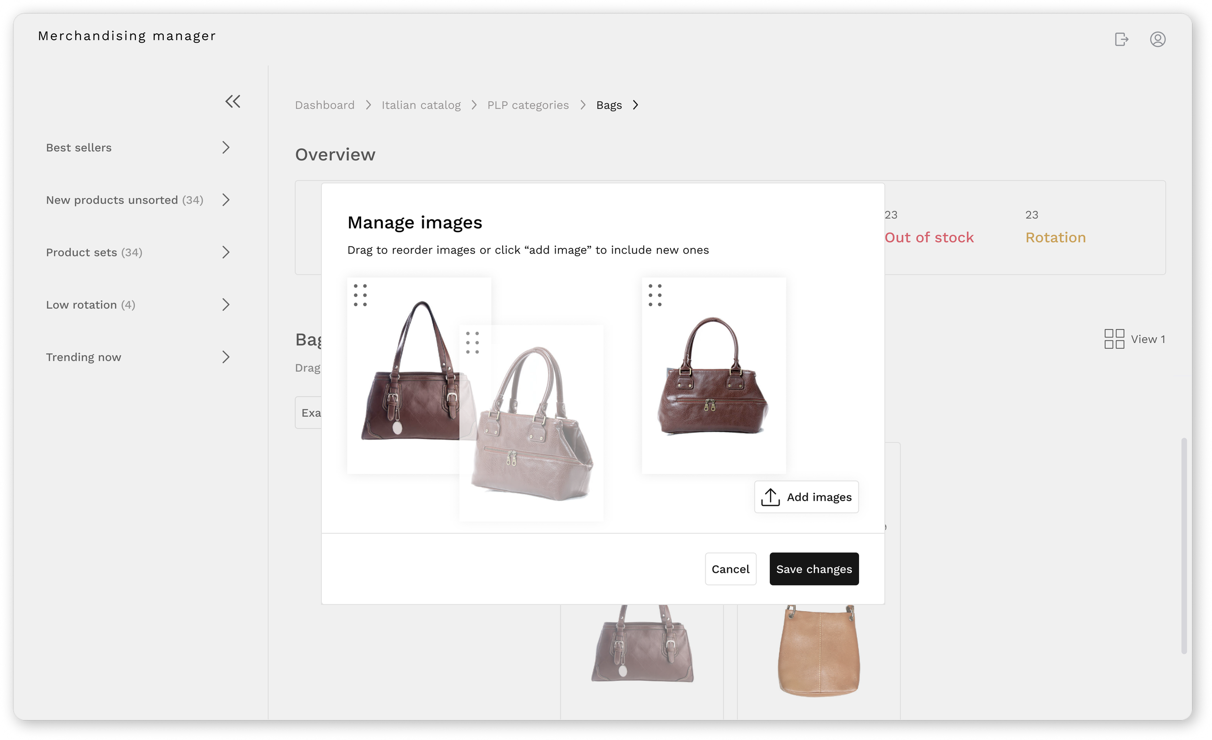
Fifth screen - reordering product images
Video prototype
Conclusion
Designing this internal tool pushed me to think more systemically about data heavy environments and operational workflows.
It reinforced the importance of clarity, collaboration and early alignment when building products that support real teams.
In future iterations, I would prioritise clearer success metrics and broader validation to better measure impact as the product scales.